Could you help me with my writing Ielts task 1, please? Thank you a lot.
Summarise the information by selecting and reporting the main features, and make
comparisons where relevant. •You should write at least 150 words. •You should spend about 20
minutes on this task.
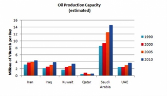
The bar chart illustrates the capacity of oil of 6 different countries produced between 1990 and
2010.
It can be seen that the capacity of oil of these countries increased over the period. The figure for
Saudi Arabia was the highest while the lowest was Qatar.
In 1990, over 8 millions of oil barrels were produced per day in Saudi Arabia while just only
about half million was produced in Qatar. The figure for Saudi Arabia significantly increased by
6 millions per day after 20 years. However the figure for Qatar fluctuated between half a million
and 1 million from 1990 to 2010.
The figure of other countries increased slightly over the period. In 1990, the number of oil
barrels produced per day in Iran was 3 millions and in UAE was over 2,5 millions compared to 2
millions in Iraq and nearly 2 millions in Kuwait. Finally in 2020, the amount of oil produced per
day in Iran was over 4 millions, 4 other countries were almost 4 millions.
Top answer
The figure is too small and blurry to read. Also, there are quite a few misused words: figure, produced, million s, and fluctuated. Read my advice and correct your essay.
Get the Weekly English Kit 📬
New words, one handy idiom, and a 2-minute quiz — delivered to your inbox to keep your streak alive.
The figure is too small and blurry to read.
Also, there are quite a few misused words: figure, produced, millions, and fluctuated.
Read my advice and correct your essay.
 0
0Le SunflowerIn 1990, over 8 millions of oil barrels were produced per day in Saudi Arabia
There are many issues with that sentence.
They are not manufacturing barrels that can be used for storing oil (oil barrels).
The plural form (millions) is incorrect.
The bar chart does not show oil production; it is about capacity
0